×
Menu
Index

Employer Dashboard

 
The two questions we are asked most frequently are:
 
 
The new Employer Dashbaord answers these two questions by comparing your practices with market practice, drawing on the data you have contributed to the survey. The Dashboard also allows you to refine your view of the data, to compare at different positions in the amrket, or with different market segments.
 
Note:
 
The Employer Dashboard was created as part of the redevelopment of the MHR RemData system during 2016. The Dashbaord report will therefore be available only from the release of the September 2016 survey results, the first survey conducted using the updated system. The example shown below is based on sample data.
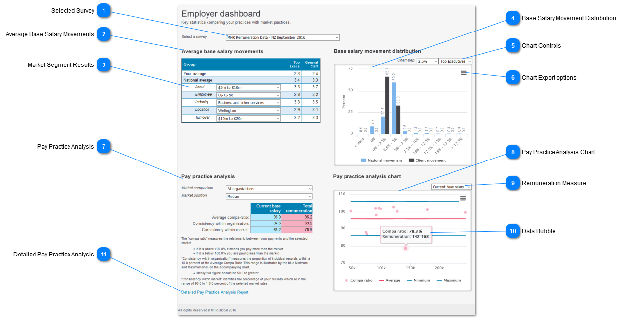
 
 
Employer Dashboard
 
1

Selected Survey

 
Sellect the survey from the drop-list
 
Note that although the Employer Dashbaord was introduced with the September 2016 survey the report can be generated for all surveys back to March 2010.
2

Average Base Salary Movements

 
Compares the Cient average increases with the average increases for selected market segments.
 
The market segments may be selected by the user, using the droplists shown in the "Group" column.
3

Market Segment Results

 
Use the droplists to select the Market Segments of interest.
4

Base Salary Movement Distribution

 
Chart showng the distribution of Base Salary increases for Client records and nationally.
 
Use the Chart filters to select the Survey Group (i.e. Top Executives; General Staff) to be included in the chart.
 
Hover the curser over a bar on the chart to view the underlying values for that bar.
5

Chart Controls

 
Use these controls to modify chart settings:
 
  • Chart steps
  • Modify the width of the ranges used to define each bar
  • The default value is 2.5 percentage points
     
  • Survey Product:
  • Change the Survey Product:
  • Top Executievs
  • General Staff
  • Industry Survey
6

Chart Export options

 
Use this to print the chart to a local printer, or to export the chart to a selected graphics format, to be used in an internal report.
7

Pay Practice Analysis

 
A summary of the key data from the Pay Practice Analysis report. An explanation of the measures displayed is included in the detailed Pay Practice Analysis section of this guide.
 
Use the droplists to select your Market comparison, Market Segment and Market Stance
8

Pay Practice Analysis Chart

 
A copy of the chart included on the Pay Practice Analysis Report.
 
The chart shows:
 
  • The individual Compa Ratios for each record, plotted against the selected Remuneration Measure values
     
  • The average Compa Ratio for the organisation
  • this is shown as the red trend line
     
  • A range of tolerance at 10.0 percent either side of the average, shown by the two blue lines
  • this allows outriders (records either above or below the range of tolerance) to be identifed quickly
  • hover the curser over a data point to identify the individual record.
 
9

Remuneration Measure

 
Use the drop-list to select the Remuneration Measure used in the chart.
10

Data Bubble

 
Click on a single data point to display a bubble which contains key information about that record.
11

Detailed Pay Practice Analysis

 
Click on the link to open the detailed Pay Practice Analysis Report.
 
This report provides the individual record detail, the overall summary (as shown on the Dashboard) and a larger version of the Pay Practice Analysis Chart.